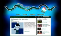
 Finally! After a week of tinkering and tweaking (and tweeting, for that matter), my website (formerly Knowing Nothing) is re-born! This is the third incarnation of the site, codenamed ‘Kurage’ (just because codenames sound cool!). The site has been completely overhauled structurally! Read on for explanation of everything (including a secret feature!) and how I did it. Please give me your brutal, honest feedback on the new design!
Background
The site is hosted on one.com, a great hosting service that provides reasonable webspace and unlimited bandwidth for a measly sum of about 25.00 pounds a year. The platform that I use to run this site is known as WordPress, which recently upgraded to version 2.7 with a smart new interface that allows you to easily publish new content such as blog posts. Finally, the theme for WordPress that I used as a template to build the website on is the fantastic Arthemia theme by Michael Jubel. It is a hybrid theme blending a CMS (Content Management System) with a blog, allowing for a magazine style layout while retaining the accessibility and personal touch of a blog. I decided to use that to inject some oomph into my content and hopefully reduce my high bounce rate (currently around 70%). Bounce rate is the amount of people who visit your site and immediately leave without opening another page within it. It’s always always a bad thing to have a high bounce rate because it means that your visitors are not delving deeper into your site.
The two previous versions of my site have been highly stylised around bioluminescence, just like this one, but seemed rather simplistic and narrow. Take a look:
As you can see, both layouts squeeze all the content into a container viewable at 800×600 resolution. I started having real trouble fitting all the content into the sidebar, with all my growing categories and widgets (WordPress plugins), so I decided to step it up. No more 800×600! It’s a thing of the past – a massive 86% of people view the web at size 1024×768 pixels and above! (Source) So sorry to all of you who still use that resolution. I recommend upgrading to at least 1024×768 and stop putting up with such tiny screen sizes ^^;. (Incidentally, the new site is best viewed at 1280×768 and above).
Version 1 of my website implemented my favoured bioluminescent glowing jellyfish (the blue ring you’ll see everywhere on the site) and a rotating banner design. You can see one of the banners I created in the picture above – Golden Eggs, the body-building episode – a hilarious Japanese ‘animation’. Version 2 of the website was more of a step towards simplicity and a cartoon feel. I drew the jellyfish icon by hand and scanned it in and created the waves in Photoshop. At the bottom in the footer you’ll find the blue ring with my cheesy catchphrase ‘Sentiments with a breath of philosophy’ ^^;. So, what’s new in version 3?
New features
Where to start? There are loads!
>> ‘Featured’ column
>> Automatic thumbnail generation for posts
>> Selection of posts that other people are currently reading
>> Photography gallery
>> Latest video post
>> Most commented and most viewed lists
>> Sociable networking icons
>> Print function
>> Dofollow function
>> Threaded comments
>> Archives
Older features:
>> Language bar
>> Japanese vocabulary widget
>> Email subscription
>> Twitter integration
>> Related posts
>> Mouseover header
>> Secret function
‘Featured’ column
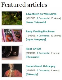 The featured column is part of the Arthemia theme design that shows a designated category (‘featured’) in this space. The benefit of doing this is to promote the longevity of posts that have been published long before new readers get to your blog. I intend to use it to show the longer articles that I write and put more effort into, as well as articles that may become popular by visitor ratings. I haven’t found an easy way of separating the Japanese and English featured posts yet, so the same list will show on both the English and Japanese versions of the website. Here is a great post that explains how to exclude certain categories on your blog – something I needed to do to correctly set up the English and Japanese versions of my website.
Automatic thumbnail generation
 This uses the fantastic ‘timthumb’ php script released by Darren Hoyt. It generates a thumbnail for images on the fly and can be utilised in many different ways. Here, the Arthemia base theme uses it to generate thumbnails for the ‘Featured’ column and all the posts on the main page. I have also used it to create list of thumbnails in the ‘what other people are reading now’ section.
Selection of posts
This was the main reason for the re-design of my website. I saw Neil’s blog and noticed he had a rather cool feature. It is a set of 5 thumbnails, automatically generated, to show picture posts that have already been published. Neil has then set up the feature on his site to show what other people who are ‘currently reading’ his website are looking at. The masterful idea here is that not only do the thumbnails draw the reader’s attention, the headline ‘what others are reading now’ seems to make the pictures even more tantalising… ‘What is that..? Somebody is reading that right now. I wonder what it’s about..?’ And before you know it, you’ve clicked and you’re there. ^^
I had the code almost right, but because my journal posts don’t all contain pictures, I wasn’t getting a consistent line of 9 pictures displayed every time. Luckily, Chris over at NihongoNotes lent me a hand and gave me the chunk of php code I needed to do this. If it wasn’t for his help I wouldn’t have the function working properly, so many thanks to him ^^V. Please visit his site for great information on Japan and learning Japanese!
Photography gallery
 Just a video player embedded into my main index page. Pretty hands-on, but it has done the job so far. The video player is one.com’s own player from the gallery they offer included in the hosting package. I may change this in the future, but for the time being I’ll try it out. Please let me know what you think. Is it a nice feature or useful for the site?
Latest video post
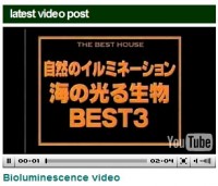 Another idea inspired by various sites around the internet, including the more advanced Arthemia Pro theme. It uses the JW media player and the custom fields section in WordPress to display the video. Tofugu also has the same feature, except there you can choose a video from a list below it. I might have to look into doing this (if I actually do any video posts in the future ^^;).
Most commented and most viewed
 An integrated part of the Arthemia theme, plus Lester-chan’s ‘postviews’ plugin. Lester-chan also does a number of other great WordPress plugins, including the Print function ^^.
Sociable networking icons
Part of the Arthemia theme. I added mixi, Japansoc and Twitter icons to the list. Click these icons to share whichever article you are reading with other people on popular sites like Digg and Stumbleupon. I recommend Japansoc, since I write about Japanese-related things the most.
Print function
Lester-chan’s Print plugin. Quite simply, it allows you to print the pages of this site without all the backgrounds and images which suck your printer dry of ink.
Dofollow function
I hadn’t realised it, but my site was automatically applying ‘nofollow’ tags to all links posted in the comments section by readers. This means that those readers get no credit if somebody clicks on the links. For example, I write on a friend’s blog and leave a link pointing back to my own journal. If somebody clicks that link and it has a ‘nofollow’ tag, the hit I get on my site from that person will not register as having come from my friend’s website, rendering my efforts to promote my website in vain. With the dofollow WordPress plugin, the website now gets rid of the ‘nofollow’ tag, so any links you post will by properly given credit ^^.
Threaded comments
One of the new features of the upgraded WordPress 2.7 is the ability to reply to other people’s posts, called nested or ‘threaded’ comments. This makes it much easier to give specific feedback to individuals and to have mini conversation set apart from the rest of the comments. The depth is only 5 comments deep though, so it really is only for short comment rallies. Great to see this feature included in WordPress 2.7 though! This post helped me immensely in styling the comments: CDHarrison and Bloggingtips helped in learning about the new changes to the comments system and about editing your theme to use them.
Archives
The archives page has undergone a cleaning up. I hope it is much more easily navigable now. Done with the aid of the Clean Archives plugin
Language bar
I’ve changed the icons a little since version 2, but essentially all functions are the same. If you cannot read Japanese and are against seeing Japanese posts, you can click on the ‘English only’ icon to see only those posts written in English. If only works on the main pages though. If you search the site, Japanese posts may come up. Vice versa, if you cannot read English (doubtful!) or just want to browse in Japanese, you can select the ‘Japanese only’ button. This will list only Japanese posts and change most of the website to Japanese. I edited all of the headers and text myself – there is no special plugin to do this in the way I want to. Note that you cannot see both English and Japanese posts on the main index page when viewing with the Japanese website interface. These are also set with cookies, so that when you come back, your preference will be remembered ^^.
Japanese vocabulary widget
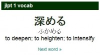 I wrote about my pains to get this working correctly here: Japanese csv database. Basically it uses Srini’s Quotes Collection plugin to draw a load of JLPT1 vocabulary from a database and display it through the Ajax widget. Sounds tricky, but it really just involves uploading a csv database file and tweaking the plugin output. Go and read if you’re tempted to have one for yourself!
Email subscription
 Email subscriptions provided by Feedburner. You can choose to subscribe to all posts, English only or Japanese only. The headlines and a short excerpt will be delivered right to your email inbox whenever I update! Alternatively, you can subscribe to my feed; click on the orange box in the title bar.
Twitter integration
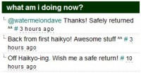 I use the plugin ‘Twitter for WordPress’ which loads my latest Twitter updates in the sidebar. Twitter is a networking service that lets you write short messages about what you are doing (or anything you like). You can ‘follow’ people by subscribing to their Twitter and receive their latest ‘tweets’. It’s great way to keep in touch with people, and although it sounds boring in principle, the real fun comes from responding to your followers and having them respond to you. You’ll see responses directed at people indicated by the @ mark. Follow me at: http://twitter.com/knowingnothing
Related posts
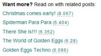 As the title states, it shows a list of posts related to the one you are currently viewing. I’m thinking about setting this up with the timthumb thumbnail generation script so that it outputs a related post with a small picture, like on Dannychoo.com. Does it encourage you to read more..? Let me know ^^.
Mouseover header
![]() I explained about the secret behind CSS mouseovers in this post.
I explained about the secret behind CSS mouseovers in this post.
Secret function
 Secret!? Have you seen it yet? Perhaps not… The clue is in the picture. Just a bit of fun if you are bored and at a loss for what to read ^^.
**********
Finally, some general WordPress help:
Free WordPress themes
Tips and Tricks
Useful plugins
Congratulations if you read all of that! I hope some of it might come in useful for others looking to beef-up their blog or tweak some features. Let me know if you have any questions. And finally, please tell me what you think of the new layout! I don’t mind harsh criticism or suggestions. Let loose with your emotions! ^^





I’ll look into the widgets.
But dang! I thought I viewed my site in every resolution possible- then i tried out yours and my monitor won’t even do that resolution for some reason. I’ll go try it on the LCD down-stairs. Thanks for telling me that. :D
I’ll look into the widgets.
But dang! I thought I viewed my site in every resolution possible- then i tried out yours and my monitor won’t even do that resolution for some reason. I’ll go try it on the LCD down-stairs. Thanks for telling me that. :D
Looks great, Mike. Thanks for the help before, via e-mail. My site is now rigged to my liking! :D (Still thinking of some custom features to add in, though.)
Thanks Mason. Well done on customising your site.
Just to let you know, the text and logo at the side are cut off in my browser (I’m looking at the site in firefox in 1280×1024). There’s also a lot of white space – perhaps you should add some more widgets and such.
i love the site… so much that i now use the same theme!
arigato for detailed information that you provide.
happy holidays!
You’re welcome! Merry Christmas!
i love the site… so much that i now use the same theme!
arigato for detailed information that you provide.
happy holidays!
You’re welcome! Merry Christmas!
Looks great, awesome features.
Thank you Paul!
Looks great, awesome features.
Thank you Paul!
Nice work Mike, looks really good. Will have a better look around when time permits.
Thanks Neil ^^
Nice work Mike, looks really good. Will have a better look around when time permits.
Thanks Neil ^^
now this is what you call a blog redesign/overhaul
looking good!
Doumo! ^^
now this is what you call a blog redesign/overhaul
looking good!
Doumo! ^^
Two other things, one: on the individual posts the twitter has nothing on it other than ‘no public twitter messages’ and two: the green looped background in the main section looks a little *too* looped. I’d try to make it a little more blended in, maybe make the image taller.
Thanks for the comments! I’m glad it feels as though the site has opened out. That’s a great thing ^^.
I think the Twitter messages are working. Could you check again? I know what you mean about the green background. It was a little rushed. Do you think it’s really distracting?
“I think the Twitter messages are working. Could you check again?”
It’s working now!
“I know what you mean about the green background. It was a little rushed. Do you think it’s really distracting?”
Not really, just something you could change in time I suppose. Nothing terribly important.
The site looks awesome, much better than it was before, its like you’ve injected a tonne of content in it in such a short period. It actually looks like you have all these posts and pictures and things, before it looked a little, hidden.
And the xmas jellyfish/random post button is a nice touch :P
I’m not sure about the green line or the dotted dividers near the top of the page (under ‘japan | philosophy | bio…’ etc.)