It’s that time again. Yet another spasm of tinkering, tweaking, coding, designing and, of course, consuming copious amounts of sugary goods well into the early hours has resulted in the newest version of Gakuranman.com. Here’s a history of the website’s design evolution!
(Note: This article was originally posted on 17/02/10, 07/08/10 and 17/01/11 but has been updated with the new site design. Everything listed in reverse-chronological order).
Version 9
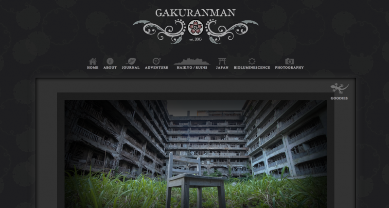
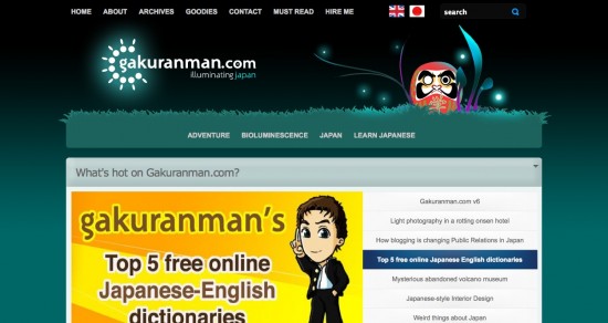
Shin Gakuranman. A new design for gakuranman.com.
Although this writeup regarding the update is long overdue, the design itself has been in place for well over a year. In this version, I went right back to basics and decided it was high time I learnt how to code a WordPress theme of my own from scratch. I scoured the internet for tutorials and got started building the basics blocks of the website with a rough design in mind.
This time I wanted to take the site in a much darker direction. I had waves of inspiration feeding me images of a vintage, rustic design. Classic, old-style fonts, shadows and a definitive nod towards my growing interest in the subculture of urban exploration, or ‘haikyo‘ in Japan.
In addition to my quest to learn how to create a WordPress theme from scratch, I also spent a lot of time optimising the website for speed and mobile devices by creating media queries for responsive design. I incorporated an adaptive images script to resize the large, high quality photos I was increasingly using in my long, detailed stories on the fly depending on the device accessing the website.
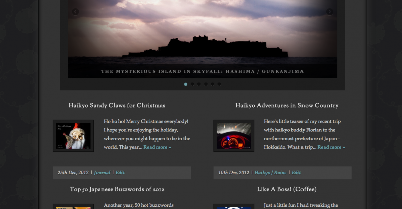
On the design side, I created unique vector icons for the main categories of my website, including a custom icon of the famous Gunkanjima (Hashima island) to represent ruins and an explorer icon to express my love of adventure. To retain the Japanese element, I spent time playing with traditional Japanese design elements which I ended up using in the page background. Social media icons were relegated to a drop-down drawer activated by jquery, just under the main navigation bar. I cleaned up the database, removing old categories and later added a jquery slider to the front page.
All in all, a huge re-design that enabled me to learn a lot and further improve on my design skills! How do you think the design compares to the previous iterations? Do you prefer the dark colour scheme over the lighter, rice-paper design? How do you feel about the lack of bioluminescent colour?
Version 8
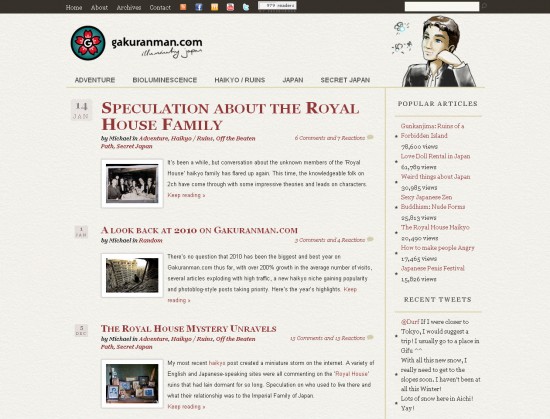
In version 8, the website has again been completely changed both aesthetically and functionally. I spent some time installing various plugins such as WP-Super Cache and Minify to try and optimise the previous version of Gakuranman.com. The site was simply generating too many database calls, leading to a slower user experience and more stress on the server. With the increased amount of visits in 2010 and growth in the site’s popularity, this occasionally meant that the site returned errors, which is never good for building a sound reputation, even on a personal site like this.
However, even with the seconds trimmed off the load time thanks to the plugins, the site was still slow and even a bit buggy due to my numerous modifications. In addition, the template I was using from the folks at Woothemes was packed full of cool features but I realised that I really didn’t need many of them at all. All the smart admin backend stuff was great but I was still hand-coding myself through habit and because I need to be able to tweak everything exactly. Getting rid of that theme (which had something like 30 pages of php and special functions for various parts of the site) to this one which only has the basic 10 for a WordPress install was a huge relief and a step back in time to when widgets didn’t exist and everything was hard-coded. It also cut the load time to 1/3 or what it was before!
You’ll notice that the site is much cleaner now, which is due in part to the new colour scheme. Most of the widgets and boxes have gone and I’ve replaced them with some simple text equivalents with the emphasis on typography. The bioluminescent colour scheme I loved and used for many years has finally been switched for a more Japanese style, red ink on a white rice paper textured background. I still love the soothing blue glow of that natural light, but I wanted to be bold with this change and try something a little new. We’ll see if the new design grows on me, but please leave your thoughts in the comments below! Do you like the new design? Is it faster for you?
Version 7
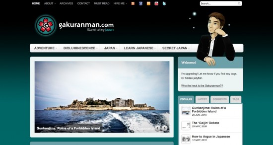
In this update the whole website has been overhauled since version 6, using a brand new theme, graphics, logo and widgets.
Version 6 was quite slow. The functionality I added using boxes that could be moved around by the user increased loading times and generally weren’t as useful as I had anticipated. I did learn that the jquery slider was a great addition however, so that has remained in version 7. The new theme is based on a template from Woothemes.
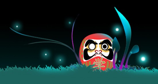
I commissioned Gakuranman artist Dave from Watermelon Studios.co.uk to create a new image for the header, as I felt the daruma – as cool as it was – was not good branding for the site. After much prodding and poking, Dave completed a more chilled-out Gakuranman image. I kept the fireflies from the previous version and the daruma I created now gets a special mention in the footer since people seemed to like it :).
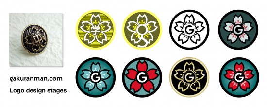
I also spent some time sitting down to really nail a proper logo for Gakuranman.com. It has been a tricky issue for me because the image Dave created is essentially what I use everywhere online, but it has little logo potential. Very briefly, a good logo should be simple, in vector format, look good in black and white and be able to be reproduced in a variety of media. I chose to model the circular logo on the button design from a gakuran, to keep things relevant.
The colours of the logo have been made to fit the current theme of the site. I did try making a gold and black logo like a real gakuran would use, but it would mean a complete visual re-branding of the current luminescence theme. It’s also bloody difficult to make gold in Illustrator! The middle of the logo utilises a ‘G’ set into a rounded shape to fit the design. It took me quite a lot of thinking and experimentation to find the best way to do it, but I think it works quite well :). Any thoughts? Below are some of the experiments I did when creating the logo.
Version 6
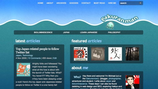
Here we arrive at version 6 of the site. Bioluminescence continues to permeate the site with a vengeance. Gakuranman.com finally gets some semblance of a logo involving the original jellyfish symbol to match the favicon (the icon next to the http://gakuran.com URL since I first started the website). I also had a lot of fun designing the daruma and surrounding natural scenery dotted with fireflies in Photoshop. I hadn’t experimented with vectors, brushes and the pen tool much before, but discovery of them got my creative juices flowing again.
You’ll also notice that I changed the theme yet again. The box design continues in an attempt to keep things pretty, but I added functionality to let readers open and close and even re-arrange the boxes to suit their browsing habits! I had planned for this to reward regular readers, as the browser will remember the settings (providing the cookies aren’t deleted). That meant that any ads readers didn’t want to see could be minimised in their respective boxes. I wanted to try giving people the flexibility to choose what they see :)
Menu systems have also had an upgrade to use jquery to sparkle things up and readers could now browse my videos and watch them on the site with a fancy lightbox plugin integrated into the theme.
Version 5
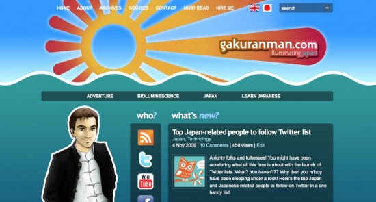
Next up, a variation on the version 4 design, placing emphasis back on the blog post and moving the social networking icons to the left. Also included is a grand new Gakuranman illustration by Dave and an illuminating new sun design, taking up most of the header. The tagline to the site changed from ‘Japan and Bioluminescence’ to ‘Illuminating Japan’ as I continue to narrow down the focus and writing style. Posts on bioluminescence still feature, but the majority of stuff is about Japan and the Japanese language.
Version 4
Summer 2009 saw me changing things yet again in version 4. Continuing with an undersea theme and bioluminescent colours, I decided to try for a smarter look. This was also around the time that I officially moved my original domain over to Gakuranman.com. The aim was to clean up the site layout, make it easier to navigate and read and to promote the ever-expanding list of social networking sites. You can see my profile and networking icons taking a central spot in the design below, and also the Gakuranman illustration by Watermelon Studios artist Dave appearing for the first time.
The jellyfish symbol continued in the form of a sun with a language button in the middle of it, but it isn’t shown in the screenshot below.
Version 3
Version 3 saw me taking my first leap into the world of CMS designs. CMS stands for ‘Content Management System’ and is basically a collection of tools and functions that allows the user to streamline the flow of work when publishing new content. I used a premium WordPress theme as a template (the Arthemia which included a whole host of new features such as a special featured posts area, automatic thumbnail generation, video integration and a language bar to switch between Japanese and English versions of the website.
I also starting thinking seriously about the SEO issues. I categorised the website into 3 themes – Japan, Bioluminescence and Philosophy and starting optimising each page for keywords and titles to help get the site ranked more highly in search engines. I was definitely getting into the swing of things in writing blog posts too and learning more about what makes a good read.
Version 2
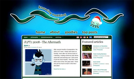
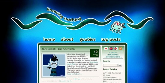
I launched version 2 of Knowing Nothing on a whim back in October 2008, 2 months before I took and passed the JLPT level 1 exam in London. “I had visions of cartoon jellyfish, waves and the deep abyss,” or so I wrote. Large changes in the design, including abandoning the rotating header image I’d been using and going for some home-drawn images and creations in Photoshop.
Version 1
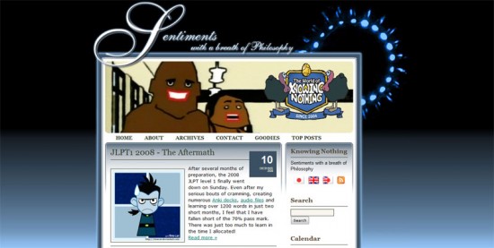
Way back in October 2007, I finally carved out the time to buy a domain, website hosting and install WordPress. Up until then, I’d been blogging on Livejournal as far back as 2003 (you can still view those old posts buried deep within this website). The concept was settled in my mind – make a bioluminescent-themed website the likes of which the internet has never seen! Oh yes, my goals were mighty and my CSS hurdles many.
Inspired by the awesomeness of the deep sea marine biologist, E. Widder, I set out to integrate the undersea image of of a jellyfish giving a display of bioluminescence into a blog design. I was also still at University and studying Philosophy at the time too, hence the odd combination of bioluminescence with the website title and tagline:
Knowing Nothing – Sentiments with a Breath of Philosophy
Yes, a real blast back to my arrogant teenage years and propensity for creating mash-ups with words. I was also well into designing original banners based on my favourite pictures and photos. In the image below, you can see a “World of Golden Eggs” banner I made in homage to the great Japanese MTV animation.
**********
So that’s about it for now! I’m still working out some bugs and features on the site that didn’t mix well with the new theme, but hopefully everything should look pretty, like the screenshot above. Also, should any of you reading be interested, I offer design services to help you set up and customise up your own blog. If you would like to hire me, please drop me a line :).
As always, I would love your criticism and feedback, especially if you find bugs. So then, here’s to many more posts, competitions and fun times!


Do I spy Dr. Drakken? Funnily enough, happened to be THE biggest Kim Possible fan in my younger years :D http://fc02.deviantart.net/fs15/f/2007/116/9/4/Signed_Script_and_Book_by_NabuSan.jpg Fond of your latest site iteration, but I feel your navigation bar is mostly ignored as it doesn’t stand out. If you can find a balance between keeping it tasteful but noticeable, I think your visitors would really be able to utilise your entire site.
Thanks for the reply! Closet Kim Possible fan myself :D. Loved that series.
In regards to the navigation bar – you mean the main category navigation at the top right? How do you feel that it doesn’t stand out? It needs more colour, or perhaps bigger text? Will take it under consideration in the next design :).
Hmm perhaps a bit old-school, but a box around each navigation button may be an idea, whether solid or a line? What colour/dimensions
those boxes are would be down to what you felt most complimented the site design. At present, even with the graphics and hover feature, I feel the buttons blend into the rest of the text too much, when it should look sufficiently distinct but in keeping with the site content. Aesthetically pleasing certainly, but perhaps not very practical. You pay a truly OCD amount of care and attention to the finer details though, so I’m sure any tweaks/redesigns are sure to impress. Good luck man!
I like the new layout and your reasons for doing it. It is texty but clean. I had not noticed a problem with load time and never got errors, but I always appreciate a view for speed and streamlining. You know the one thing I inexplicably miss? Your bioluminescent daruma doll. Maybe he could still “footer” somewhere, in a box like you have him above?
Thanks JPA. I had a similar comment on the site last time when I re-designed but omitted the daruma. Seems he has a few fans ^^;. I’ll see what I can do!
oooo I was around at version one and before that on livejournal. Does that make me your first ever subscriber ? ^^;
Perhaps so! Man, those livejournal days…
Thanks Linda :).
This is a good post, I stumbled across your post while looking for downloads. Thanks for sharing, I’ll be sure to come back.
Cheers for sticking around :)
Golden. Great, useful info.
Version 4 was the best, although I do like 6.
I discover this blog when It was using the latest design V6 and I love the overall design which is better than its predecessors.
Cheers for sticking around :)
Cheers for sticking around :)
I think I started following this blog around version 4… I looooove the new layout, it really looks awesome! Looking forward to what the future brings :D
Just some things I think would look awesome.
1. Maybe the gradient could be from a slightly darker blue than black and go for longer down the page.
cool theme, like the site layout looks pro + clean
top job mike. love seeing how your brand evolved along with your mastery of the CSS black art.
Don't fear Rob. I started out just as your have done with a default WordPress theme and some ideas. I remember feeling very humbled by all the great site designs out there so just began slowly with what I knew. Just experiment and enjoy playing around – progression will come naturally I think :)
Thanks Katie :) I love blue myself and totally agree – never too much blue!
I like V3 the best though…
Too true! Posting frequency is still way down x_x. Thanks for the kind words though!
Wow, it looks really nice!
I'll be honest, I never even knew about anything prior to v4, but you've definitely shown how much the site has evolved since you first started.
…. I'll go back to my default blogspot template and weep quietly now.
:D
Again, great job!
Love it love it! The luminescence really holds pride of place on the new design, and the favicon image is very sleek and easy to identify.
You can't do too much blue, in my opinion. It is by far the web colour that's both chic and easiest on the eyes.
Looking good, looks very professional. I love the header and the daruma is cool. I really like the logo part with the luminous jellyfish. Well done with that.
There's a real progression from your original site to what it is today. Good stuff. Now you just need to post a bit more! Haha.
I’m digging the new look.